Documentation
Other: Usage graphs
When RRDtool is available in your system, the information collector option of the General section can be activated to generate several usage graphs.
These graphs will represent several metrics (shown as current, average, max, and total measures) against various time intervals (1 hour, 6 hours, 1 day, 1 week, 1 month).
The graphs can be accessed through the status section and the logging tab of each virtual server.
Status section
Three types of graphs are available. You can switch between them at any time.
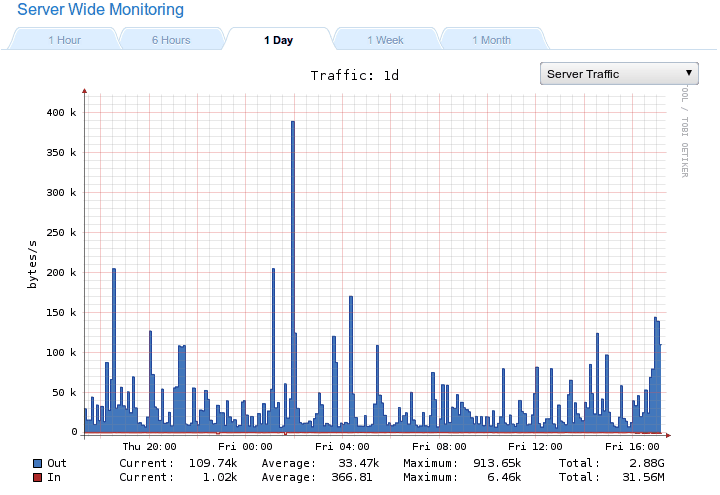
Server-traffic
This is a straight forward representation showing the amount of bytes per second that were downloaded from and uploaded to the server.
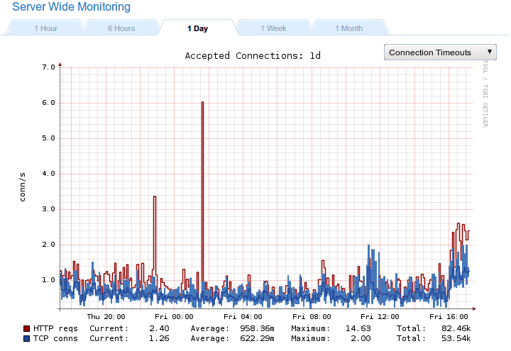
Connections / Requests
This one displays HTTP requests and TCP connections. Since you can have Keep-alive enabled connections, several HTTP requests can be issued through the same one thus considerably improving the web server’s performance. Worst case scenario, both graphs will the same. In normal conditions HTTP requests can be much higher than TCP connections.
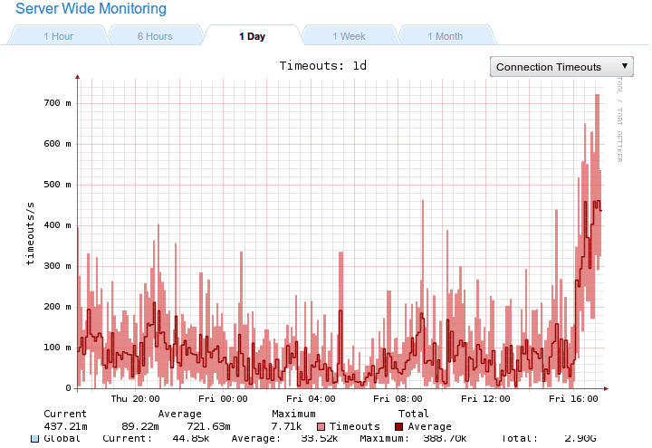
Connections Timeout
This graph will show the maximum, minimum and average number of connections that are timed out per second. These timeouts can happen for several reasons. If Keep-alive is enabled, a client will be able to keep the connection lingering to improve performance. If this happened indefinitely, sooner or later the server would be unable to serve new requests. These connections must naturally expire according to a configurable value to leave space for new users. Connections can also timeout if a backend ceases to respond, which is something you will need to monitor.
Since each pixel of the graph can correspond to several seconds, minutes, or hours, it makes sense that the upper borders of the red zone will correspond to the maximum number of timeouts. The lower borders will be the minimum, and the darker line in the middle will represent the calculated average.
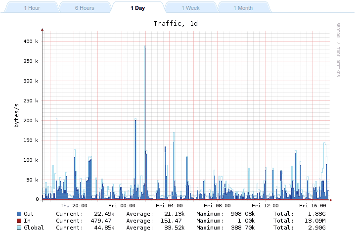
Virtual server’s logging tab
Just like the Server-traffic graph, it displays the amount of bytes per second moving back and forth, in this case limited to a specific virtual server. The global representation would show the total amount of data transmitted by the whole server, which corresponds to the sum of every virtual server’s outbound traffic.